Font: NGC 292
Appeal Point:
- Still emphasize about network value of Plasm Network Identity and Technology.
- Evolution from old logo with modern style of design.
- Added Polkadot color identity on Output 2.
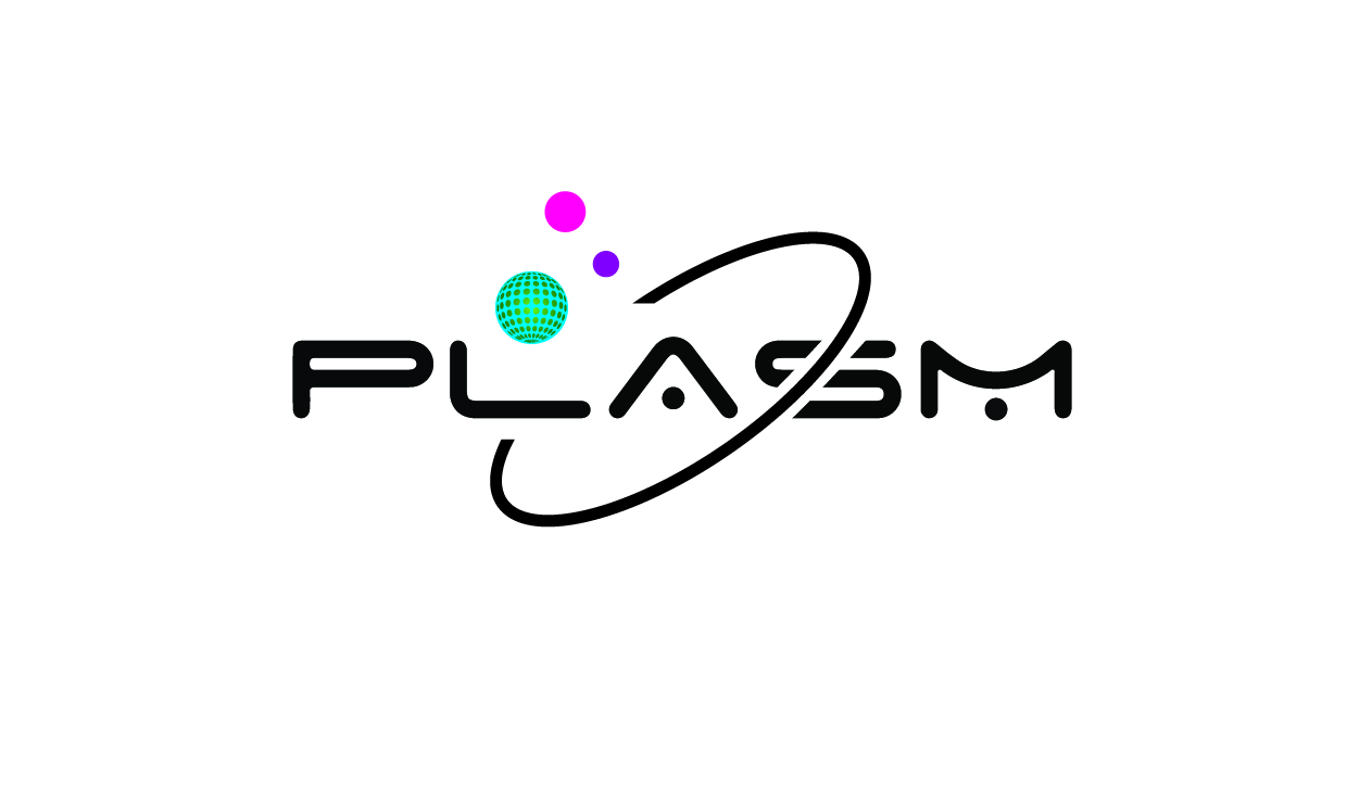
Font: NGC 292
Appeal Point:

Hello, I am WATASI . I created a new logo of Plasm Network as shown below.
Font: Zyana
Here are some of appeal points.
And you can see jpg, png, and svg files in this folder.
And this is my plasm address: ZMB8AEsNMd6L9yLXPRQMDEJyTejJTTgnxseFMfvHdZGBjxE
Fonts: TRIUMVIRATE COND
Appeal Point
1.Design Base on how to deal with Others. P with the Shake Hand Logo was Symbolize as Strong Partnership or Dealing With Others in Exchange ETC
like what weve been doing in a Platform.
2. it is Simple but kind of competetive Logo.
many people will attract to plasm because the logo was Cool and attractive
Hello, I am [poljos06]. I created a new logo of Plasm Network as shown below.
Font: ADAMCG PRO

Here are some of appeal points.
1.I want it simple it has light color
2.Formal appearance
Plasm address : ZXJwkRFc3yLenPrE88Mh4FtFMZaWph4EMLbMsmaiqYNyTh7
Hello, I am Angela Trishia Clemeno . I created a new logo of Plasm Network as shown below.
Font: Original Font ( I want to make it simple )
Here are some of appeal points.
1.Trying to emphasize the parachain look
2.I put the pink dot in the middle to emphasize Polkadot
And you can see jpg, png, and svg files in this Folder
[Drive Link: PLASM NEW LOGO YEAR 2021 - Google Drive]
HERE’S MY PLASM ADDRESS: YLyXpiy5gTRMh51Kj3GXfLUR72bn2fgUsqwexsV5si5aYLb
Hello, I am Geen. I created a new logo of Plasm Network as shown below.
Font: Gputeks
Here are some of appeal points.
And you can see jpg, png, and svg files in this folder.
And this is my plasm address: WroTWFRvzAwcEJF4BFrPQzhAdbuYDH4mtv4hDRV8ykiWUzh
Font name : nirmala ui
another one is this.
Font Name: Niagara Solid
1.The glossy planet is likened to a network.
2.The band on the planet indicates the layer. Because Plasm Network is a layered solution.
Plasm Address: 167rXWTLmCNSWMNSfUEEchMjU4knV5Aw2PcQQJZjqEpWPELj
Hello, I am [Name]. I created a new logo of Plasm Network as shown below.
Font: [Gotham]
Here are some of appeal points.
(Plasm Re design - Google Drive)]
And this is my plasm address: [Xi5UXFf65QSB48sNYw1ZshwWURbruUjGSXF97YFBAebdTS7]
Hello, I am [LONG_DUONG]. I created a new logo of Plasm Network as shown below.
Font: Space Age.
Here are some of appeal points.
Hello, I am Marat. I created two templates of new logo of Plasm Network as shown below.
Font: Jura (Semi Bold)
Here are some of appeal points:
And you can see jpg and png files in this folder. Also I can upload psd.
https://drive.google.com/drive/folders/1SdIjtk1QMHYEEtjUnEJPoySCv-9b29a8?usp=sharing
And this is my plasm address: bTkNbasdyujJVsCfUM5A2EZcgzbaXJQdTepqiMAs3YiSwrx
Hello, I am Wojciech. I created a new logo of Plasm Network as shown below. (Logo 1 out of 2)
Font: Custom
Here are some of appeal points.
And you can see jpg files in this folder.
https://drive.google.com/drive/folders/13zLNlqiQrzupcZ2Y4B7Jw1UazwAi-z0H?usp=sharing
And this is my plasm address: ahPvTu9q9r9MBa8xWjfyLx7osoPJsdXDHtF9QgFtgaeh2qz
Hello, I am Wojciech. I created a new logo of Plasm Network as shown below. (Logo 2 out of 2)
Font: Custom
Here are some of appeal points.
And you can see jpg files in this folder.
https://drive.google.com/drive/folders/13zLNlqiQrzupcZ2Y4B7Jw1UazwAi-z0H?usp=sharing
And this is my plasm address: ahPvTu9q9r9MBa8xWjfyLx7osoPJsdXDHtF9QgFtgaeh2qz
We noticed that some of the submissions conflicted with copy right issues. The content must be original.
Hello, I am Yarrow. I created a new logo of Plasm Network as shown below.
Font: Existing Plasm Font
Here are some of appeal points.
I can provide any jpg, png, and svg files at any time upon request.
And this is my plasm address: ZJ5KnGCzQcdSUrJJvXy7LKWtezy3v7rZXVaXVYJN4MeHooW
Hello I’m Rudy, I try to proposed several logos of Plasm Network.
Drive Address : PLM CONTEST - Google Drive
Font : Bahnscrift
Appeal Points :
Reason why I proposed to drastically change the logo (despite it is requirement not to drastically change) is because to make PLM stands out within the whole cryptospace that filled with web or node or network or square-line-circleish design look.
PS: I’m not a Japanese  and sorry for my grammar.
My PLM Address : WDH3Yq8pp2hUk448Lz1GvLsvL7p5FjWENFsacaHLFZDmWH2
Hello, I am Joselito. I created a new logo of Plasm Network as shown below.
variant on google drive link: https://drive.google.com/drive/folders/1hnjb5jiHDsgY_JfhWYOa8s8JoAqSh9Rs?usp=sharing
Font: Russo One / Brandish
Here are some appeal points: