This is very good information. It should help users get a clearer overall picture. If I may, I’d like to consult with you a bit further:
Regarding the tab of dApp Ranking During Build&Earn Subperiod data, I think it’s excellent. It would be even better if we could add information on the % sharing for each item, which might make it easier to understand.
Following point 1, in terms of tiers or ranks, it might raise questions for users. If we had an explanation, it could help users understand better.
Numerical data, when there are many numbers, means a large quantity. But from a data perspective, it becomes significant when compared to something else, such as comparing to the total amount in percentages. Because the maximum is 100%, it can effectively convey that something is truly abundant.
Okay, I understand. I’m trying to share from the perspective of new users who might not understand what this is. Perhaps an explanation would help them understand better.
However, all of this is just an initial idea. The information you have is already good as it is. =)
Regarding the tab of dApp Ranking During Build&Earn Subperiod data, I think it’s excellent. It would be even better if we could add information on the % sharing for each item, which might make it easier to understand.
Regarding this point, you are right. This “dApp Ranking During Build&Earn Subperiod” page simply shows the rankings. The Astar Portal serves as a complementary role because it does not provide an instant overview.
However, your message lacks specificity. There are patterns such as the staking ratio of each dApp across all dApps or the staking amount ratio per staker for each dApp. By the way, both are feasible and have already been implemented, although they are not displayed on this page.
The former is displayed during the Voting Period (on the “dApp Ranking During Voting Subperiod” page). The latter is represented on the “Staking Amount by dApp Staker” page.
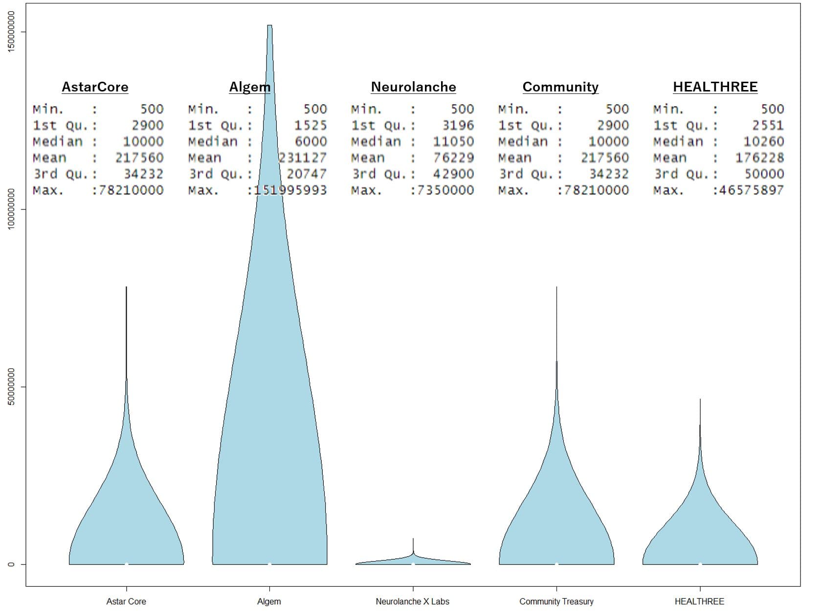
By the way, I have a certain level of knowledge and skills in statistics. Do you know “R” or “R Studio”? Recently, I posted something like the following on X. This graph alone is abstract, but if you add basic statistical information, you can see the distribution of how much each staker is staking in each dApp.
If you are going to add expressions, I think it would be good to provide some insights for stakers and dApp projects. If you come up with any specific indicators like that, please let me know.
That’s great. I don’t have any expertise in technical matters or statistics at all. I’m sure your skills are definitely better than mine. Anyway, thank you very much for helping to explain further. I’ve learned a lot more. =)
Hi @tksarah , I also am very impressed for the dAppstaking data you provide on your website.
I noticed that If the features @defiguy mentioned above are traceable in some way, then those might be beneficial for the offchain governance (see Astar Townhall - Offchain Governance - #43 by pithecus), if it is possible to give weights for those who have regular onchain activities, though nothing is discussed yet.
Hi @pithecus ,
Thank you for your comment.
Yes, some of the suggestions he made are feasible.
I wish I had more time to code them thoroughly, but I have added them to my backlog.
Previously, there were requests from the community regarding a Japanese NFT project, so I prioritized that. (By the way, this project has decided to collaborate on Soneium.)
Recently, the API was updated, making it easier to implement, so I have updated the “Staking Amount by dApp Staker” page.
Update summary
Nov.21 2024 EVM (e.g., Metamask) addresses are now displayed. The following information is available.
・You can see the addresses staked with EVM [ (Staker/EVM) ] column.
・You can see the native addresses of those staked with EVM [ (Staker/Native) ] column.
・For those staked natively, the [ (Staker/EVM) ] column shows “N/A”.
This update allows you to check how much is being staked per project and per user and identify those addresses. Previously, only Astar Native addresses were available, but now you can also see the addresses staked with EVM.
This is great help for Astar Degen Dao since it allow us to follow evolution of dApp stakers support over the course of staking seasons.
By downloading the excel file on a monthly basis, we can track which wallets are decreasing their support.
Based on this tracking and our user database, we can then try to contact them to understand why they reduced their support and take proper action to regain their support when possible.
would recommand to any dApp to get a deeper understanding of their community staking behevior and/or support
Hi @tksarah
I was wondering if it would be possible to add a column to identify wallets when they have an onchain ID or if they are part of maine figure of Astar Eco like (Astar foundation wallet, astar community treasury, core team etc…)?
I think it would be interesting for transparency to be able to distingish those wallets in the dApp staking proportion on dApp.
It would be important to know if a dapp with 30 million stakes is supported by 1 person or a real community. The staker should know this before staking. It is a centralizing factor that can also lead to behaviors outside the rules (as happened). It would be useful to have a pie chart of the distribution of stakes on each dapp.
Thank you for the update! Adding EVM addresses to the “Staking Amount by dApp Staker” page is a fantastic improvement. It’s great to see both EVM and native address data now available—super helpful for analyzing staking activities. Great job!
On this page, you can input the CSV obtained from ‘Staking Amount by dApp Staker’ and display the ones from the staker list that have their on-chain IDs.